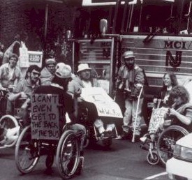

Image 1: From the NY Times today. A man and woman stand at adjacent cubicles, each with a treadmill installed under their elevated desks, talking on the phone and working.
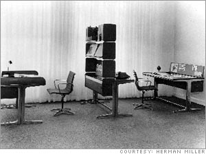
Image 2: From Fortune. In a black-and-white image of a modern office interior, two desks flank a bookshelf-like room divider, creating separate spaces with matching desks and chairs.
NY Times: treadmills in the office. You know how there are tons of coffee table books showing people in their houses, talking about the stuff they use for their daily routines? I would like to see more about office space and how people REALLY use them... specifically how people are working out the problem of sitting still all day. To me treadmills go along with adjustable chairs, ergonomic stools, and the variety of office equipment that is specifically designed so that people with disabilities can work in offices (or at home).
It reminds me of Herman Miller's Action Office, which, when it was developed in the 1960s, brought the possibility of flexibility to office design-- and despite the general disdain for cubicles at least they allow a little more flexibility than the static grid that preceded (which we can remember through the fabulous TV show Mad Men, furnished in vintage Herman Miller.. but I am getting off topic here).
Anyway-- the Times says that "still, to most, work-walking is 'a freaky thing to do,' said Joe Stirt, 60, an anesthesiologist in Charlottesville, Va., who works and blogs in his off hours while walking up to six hours a day in his home office." "Freak" is in the eye of the beholder, of course...
Wall Street Journal via Core77: New Open Solutions High-Tech Usability Lab. This article is a little business jargon-y but it's interesting to note how market research has changed over the years.. going from "what would you buy" to
Usability tests can be conducted on existing products and at key points throughout the creation of a new product including: during and after the design process, after it's been deployed and when it's deployed in a different cultural environment.
Figuring out WHO you design for and all the many people who might not quite fit with your initial assumptions is basically what usability is all about. I wish I could figure out what "high tech" methods they use to figure this out!
Core 77 blogger hipstomp is "missing the tactility" of flip-phones vs. the new movement in many phones toward touchscreens. I totally agree-- hands used to keyboards, not to mention shakier hands or ones that find it hard to hit touch-screens precisely will benefit from the choice of high-performance phones that have buttons on them. The Blackberry Pearl may end up being the choice of many who like the feel of flips and buttons over the slippery smooth iPhone.


