A blog about universal and accessible design
Thursday, November 12, 2009
two new architecture projects
- The Interlock House was a recent entry in the Solar Decathlon in DC (via Urbantrekker). Designed by a team from Iowa State, the house "is designed specifically to appeal to seniors and meets all regulations for accessibility under the 1990 Americans with Disabilities Act. The house is also designed to "interlock" into existing communities instead of taking over undeveloped land—a much more sustainable approach to building." (nice way of putting the joint goals of universal design and sustainability)
Image: Computer drawing of the Interlock House, a modern, rectangular house with an angled roof covered in solar panels and surrounded by a yard and blooming garden. A wide, flat deck that wraps around the corner. In the mock-up, an older couple go about their daily tasks: she is arriving with a bag in hand, he is raking leaves.
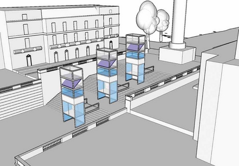
- Temporary solar-powered wheelchair lifts are to be installed at the Duke of York steps in London for the Festival of Architecture next year (via bd). Cool solution for the age-old historic buildings accessibility problem, and fitting modern look for the festival. Reminds me of my old post on a world without stairs.
Image: Computer drawing of the three-tiered Duke of York steps, with the mock-ups of three glass towers installed on the landings to house wheelchair lifts.
Monday, November 9, 2009
college
This is a brand new frickin’ building. If no accommodations are made to make it easier for disabled persons to enter, what is the purpose of the signs? Are they just put there to tell people with disabilities they are welcome inside — if they can manage to get in? It’s like saying, “We have food, but you’re only allowed to smell it from outside if you can’t open the door yourself.”I'm dismayed at this design goof, but I love the insight into how students these days see accessibility requirements, which for many of them have been in place since they were born (sorry fellow old folks -- many college students were born in 1990 or later). The op-ed quotes the ADA and the University's diversity policies and asks how this oversight could have happened. For them, these codes are a given, and violations (at least violations this obvious) an outrage. We're a long way from the early disability rights activists at UC Berkeley in the late 1960s, who had to ask fellow students to drag their wheelchairs up and down stairs, and plan their classes around physical barriers around campus.
Wednesday, October 28, 2009
new links
"Art and Abilities" - an annual special exhibition/event at the University of Michigan.
Online slide show about web accessibility, by Ann McMeekin.
Cool thing: via Designing Well, a 1949 film clip of the "Step-Saving Kitchen," with a reminder of how many of these suggestions (standard postwar scientific management stuff) would be considered "universal design" today (music added by YouTube user and is not original):
Easy-to-reach shelves and storage, cookbook page holder, pull-out work surface to sit at, and a rolling cart. Not to sure about those drop-in cooking surfaces though...
Tuesday, October 20, 2009
New Blog (feature): Accessibility Watch
Some restaurants that lack elevators, or that have stairs without proper hand rails, train their staff to look out for the handicapped and help them enter. But, in my experience, most do not. I know of many clubs in wonderful older buildings, often ones that are landmarked, that have little or no access for any level of the disabled. I wonder if the general feeling is that a landmarked building is exempt from the ADA.
We are looking for comments and examples of accessibility issues from all who visit our site. Please remember that at any hour of any day, any of you could join us handicapped—temporarily, I hope—due to a sprained ankle, a bike injury, or other chance accident. Leave your public comments using the form below [here], or e-mail your examples to pov@metropolismag.com.
The call is for New York complaints, mainly -- but it would be interesting to see a central spot for accessibility watches. I wonder what the most common access issues are, in ADA compliant, noncompliant, and exempt spaces?
Thursday, October 15, 2009
I like this poster
Poster designed by three Delcastle, Delaware high school students for Disability History and Awareness Month. One of the team drew on her own disability experience in the design, which I find very clever. It must have been fun making up handwriting for all of those people! Read about it here.
Photo description: the poster reads "Don't Label Me As a Failure!" in block letters, with a lot of colorful "Hello, My Name Is ___" stickers below with the names of famous people with disabilities - ranging from Helen Keller (with a smiley face) to Jay Leno (dyslexia), Dan Ackroyd (Tourette's Syndrome) and Thomas Edison (Deaf).
Thursday, October 1, 2009
Access, info, technology
In access hacker Liz Henry report on visiting Whirlwind Wheelchairs - a great review of the work Whirlwind does making wheelchairs for (and in) developing-world contexts - she describes conversations about sharing DIY tinkering/engineering info. One of the Whirlwind folks mentions having piles of plans and materials but no where to put them; they also discuss how many people have small technical solutions that could be shared with fairly simple instructions, but no easy way to distribute. Liz writes,
I ended up feeling like we were all talking about a similar vision and project. A central repository, managed by a trustable institution that won’t go away, with the information portable, translatable, and with room for comments and input and tagging. Phase 1 might be simply scanning rather a lot of information and sticking it up somewhere that it could be indexed by search engines. Metadata could be added and good OCR correction done on the PDFs, by people hired from a grant and/or by volunteers coordinated in the manner of open source software projects. Phase 3, probably at the same time as phase 2, would be builders and makers, trying some of the projects and posting feedback, which might just be a photo or two of the build or the result, with a paragraph of description. Phase 4 we can think of as the times people improve on an original design in their subsequent builds.
I think Liz really hits on one of the big issues in assistive technology development: information and access. My sense is that there are parts of the design world who are interested in simple instructions, easy DIY products (like ReadyMade, which publishes simple home/furnishing hacks as well as selling mail-order kits; and the whole Make/Instructables world). It really strikes me that this is what Graham Pullin's Design Meets Disability misses (though it raises other interesting issues) - the reality of how people get things, afford them, make them. I'd love to see more about groups like Whirlwind that operate outside of the giant medical technology company world. It doesn't seem like a coincidence that they are operating outside of the US health care system.
notes
Speaking of David Serlin, he is giving a talk called “Touching Histories: Personality and Disability in American Sex Studies of the 1930s” at U Penn next week, on October 6: info here.
Tuesday, July 14, 2009
The Ugly Laws book tour dates
San Francisco: Tuesday July 14 (With "Tiny" Garcia of Poor Magazine,
Leroy Moore, Coalition on Homelessness and the Po' Poets): Modern Times
Bookstore, 888 Valencia St, 7 pm. Focus on connections to continuing
criminalization of poverty today.
Cleveland: Sunday July 26: Barnes and Noble Eton Collection, 28801 Chagrin
Blvd, Woodmere, 2 pm. Focus on Cleveland and Ohio disability history.
Chicago: Tuesday July 28: Access Living, 115 W. Chicago, 6-8:30 pm. RSVP
to Riva, 312-640-1919, rlehrer@accessliving.org. Focus on poor disabled
peoples' resistance to the laws.
Chicago: Wednesday July 29: Women and Children First bookstore, 5233 North
Clark Street, 7:30 pm. Focus on connections betwen the policing of
disability and the policing of gender in the laws.
See http://www.booktour.com/
Monday, July 6, 2009
thoughts on the Kindle and computers
These kinds of debates will intensify as more and more electronics come out that use alternative interfaces. Fast Company recently asked top designers, "What Will Cell Phones Look Like 10 Years From Now?" and their responses showed this interest in multi-sensory, flexible computer interactions: phones of the future, they said, will fit on fingertips -- or even IN fingertips -- or will be gone entirely, as we will mine data from "account based networks" that one designer calls "the cloud" (though he is not specific about what kind of device would be used). Touch screen elements are still a curiosity in full-sized computers (2 M out of 300 M PCs sold have them, according to the NY Times, but more are on their way) .
Touch-screens, speaking computers, and interactive devices that are freed from the standard screen/keypad type of interface (like the Wii) have tremendous potential for disabled users. Still, as Jim Tobias of Access on Main Street comments, "we’re just doing target practice here until real stuff shows up" -- that is, a lot of these new devices point in the direction of greater accessibility, but are not there yet. One of the problems is that the makers of products like the Kindle do not integrate awareness of disability into their products from the get-go-- and for those who imagine improvement is inevitable, let's keep in mind that Kindle is already on version 2 without fixing this problem-- in fact the problem is worse now that publishers have some say in whether books can be read aloud. Here are some products that do address a fuller group of users from the start:
- I noted in an earlier post that Google has worked to make touch screens easier to use for visually impaired users. The design team (which includes engineer TV Raman, who is blind) came up with a "relative" touch application for Google's mobile Android operating system. The cleverly named "Eyes-free" shell makes any place the user hits become the center of the screen (for dialing, the first touch locates the 5). Eyes-free has a YouTube channel with videos about the program.
- Australian designer Rhys Cooper recently won a MEX Mobile User Experience award for his Doo Phone, a cell phone interface designed for people with intellectual disabilities. Its simplified menus and large images representing most frequently-called numbers help keep users from getting "lost" in their mobile phone menus. The Doo Phone certainly has promise for a broader population as phones become more and more complex-- and it helps that Cooper designed it for existing mobile platforms.
As for the Kindle in university education, it seems faulty to invest a lot of institutional energy and money in a device that still has a lot of problems from an intellectual property standpoint. Because of its strong Digital Rights Management aspects (i.e. you cannot read a Kindle file on another device), it limits the user to just one interface. Recently Core77 reported on some ID students' designs for smartbooks for Freescale-- they included touch screens, collapsible keyboards, and thin, mobile elements that could be arranged in a variety of ways. As the students brainstormed the design project, they drew inspiration from both mobile phones and video games-- drawing on their own knowledge of the potential for highly flexible and mobile devices. Variety and tactility will be key in this market-- something the Kindle seems still to be working out.
Sunday, July 5, 2009
Disability Meets Design meets the press
As this book gets attention in the non-disability-related press, this example will appear again and again. It's a good one. But Pullin also discusses design for people who use significant and very visible equipment, such as communication/speaking aids. Pullin also mentions a project in which designers worked in close collaboration with individual children with disabilities to develop products specifically for them. One of the designers created a light-up badge (I think we Americans would say "button") for a girl named Somiya, whose speech is impaired, so that she could quickly and easily add her own voice (so to speak) to an initial encounter. The message she chose was "Somiya says SOD OFF" -- a greeting I find so delightfully pissy as it completely refuses to capitulate to the charitable gaze that is most likely sent her way a lot of the time -- and which infuses a lot of writing about design and disability (below, the badge with its white words on a bright red background). Source.
The SOD OFF button isn't in any of the reviews of Pullin's book, as far as I have seen. I can't help but think this might be because it does not have a feel-good tone -- one that might fit with Rawsthorn's title, "Crafting for the Body and Soul." It's important in our discussion of design for disability to note that it is not just "sub-standard" design that stigmatizes-- it is disability. Design has the power to call into question stereotypes and expectations, and to provide alternatives to existing limitations. HearWear is the low-hanging fruit of that project-- a great example, but one that is still a fairly small target. Pullin's book rejects (implicitly and explicitly) the idea that design for disability is a charitable, "responsible" project -- instead, he argues that it cuts to the core of what design is about, shaping human experience. Even in some of the terms Rawsthorn uses-- noting the "heroes" of Pullin's book -- she retreads some of the same tired ground where disability is a do-gooder project, not just one that makes a lot of sense.
Friday, June 26, 2009
design and disability -- practitioner version
"This is an opportunity for all constituencies in the profession of architecture to hold up a mirror to their everyday attitudes, and re-evaluate the manner in which disability is treated in both architecture education and practice," commented David Gloster, Director of Education at the RIBA."
Saturday, June 13, 2009
link roundup: city life/facilities edition
The Dallas Morning News describes the experiences of an architect who spent 24 hours as a resident in a nursing home to understand the design issues
Chicago will open a National Public Housing Museum in the last remaining building in the WPA-era Jane Addams Homes. I wonder if there will be any discussion of disability issues, like the poor choices people with disabilities face in public housing and long histories of abuse in public hospitals/nursing homes.
Another tidbit of history: Penny Richards at Temple's Disability Studies blog spends some time in the Library of Congress' "Flickr Commons" and finds evidence of early 20th c. wheelchairs as a public convenience at the Bronx Zoo (much like at zoos/museums/etc today).
Thursday, June 11, 2009
summer reading
Tuesday, June 2, 2009
Old Houses
It's been a while since I lived in a HOUSE -- a free-standing, non-attached building where I have free range of 2 (3 counting basement) stories. I'm in Newark, DE, for a couple of weeks for the second annual Public Engagement/Material Culture Institute, a part of an NEH-funded program to support graduate students in sharing their research with a broader public. I am renting a room in the top of a small, mid-century (my guess would be postwar) house on a cute leafy street very close to campus. The neighborhood has similar Cape Cods and other revival-ish single- or multi-family houses, many of which are chopped up into collegiate apartments.
Pictured at right: the house where I am staying, a beige-stuccoed house with a low gable and a small awning over the stoop to the left of the picture. Plants are overflowing in the Delaware sun.
Being in this house I am immediately aware of the dimensions of houses built in the mid 20th century. These are modest spaces compared to the "great rooms" of McMansions and even the roving open living/family areas of 60s ranch-style homes. And the doorways: small. 30" doorways -- 32" is the ADA-compliant minimum-- and similarly narrow, as well as steep stairway. It's just a different scale than recent construction.
In the 1940s through 60s, when this housing type was increasingly common, filling the middle-class suburbs of postwar America, people with physical disabilities and their families had to take some creative approaches to make do with cramped spaces and narrow passageways. The polio-generation magazine the Toomey J Gazette ran pictures of a lot of these home-fixing projects, like a ramp pinned to the side of a house, with a trap door so the non-wheelchair-using household members could still use the steps.
(image from Toomey J Gazette, Spring 1961: three shots of a modest, clapboard house with a wheelchair ramp attached to the front. Images show a man pushing a woman in a wheelchair down this ramp; in the others, the man demonstrates how the middle of the ramp can be raised or lowered, adding or removing access to the stoop.)
Back in Newark, across the street from the house where I am staying there is a pretty non-descript rental house with a brick front and porch with a balustrade-- but no handrail down the few steps leading up to it. Someone has added one, a bright red number made of pipe parts. No doubt someone -- a landlord or a resident -- decided this house should be kinder to the tired legs that might be climbing up those steps.
Sunday, May 10, 2009
The NY Times has an exceptionally evocative, personal obit today for Martha Mason, the author of a memoir, Breathe, about her life using an iron lung for the last 60 years. According to the article she was one of about 30 people who still use iron lungs in the US. The article tenderly evokes the rhythms of life using a large, unwieldy, but life-saving piece of equipment that eventually becomes part of the daily routine:
From her horizontal world — a 7-foot-long, 800-pound iron cylinder that encased all but her head — Ms. Mason lived a life that was by her own account fine and full, reading voraciously, graduating with highest honors from high school and college, entertaining and eventually writing.
She chose to remain in an iron lung, she often said, for the freedom it gave her. It let her breathe without tubes in her throat, incisions or hospital stays, as newer, smaller ventilators might require. It took no professional training to operate, letting her remain mistress of her own house, with just two aides assisting her.
...
Ms. Mason often gave dinner parties — she ate lying down, with her guests around the table and the iron lung pushed up beside it — and savored lively conversation, good gossip and the occasional bawdy story. Amid the rhythmic whoosh ... whoosh of the iron lung, the local book club met in her home.
This was a good sentence to read too:
Ms. Mason’s only immediate survivors are her aides, Ginger Justice and Melissa Boheler, whom she considered family.Hat tip: SDS-discuss listserve.
Wednesday, April 8, 2009
speaking of iPhones (or at least touch screens)
Pretty much a classic Universal Design scenario-- two engineers (one of whom is blind) at Google develop an option on a phone where the touch-screen does not require you to look at it (wherever you touch becomes the "center"). Presto, it works for everyone who is trying to do stuff on a touch screen without looking at it, like while driving.
It makes sense when you design interfaces to think of a broad group of users. The Amazon Kindle, which seems like such a great product for blind/low-vision users, has an audio option but not an accessible interface (voice prompts, etc). Opportunity missed, PR screwed up. (hat tip)
Sunday, April 5, 2009
I hate my iPhone
When I talk to anyone over 60 or so, the cell phone issue often comes up. These things don't work that well for a lot of people-- they are small and hard to see and hard to program. The market seems to provide for the range of preferences-- don't like the iPhone, get a Blackberry.. or a Jitterbug, pictured above. The letters are larger and "click" when you push them, the screen is stripped down to the basics with few add-ons or menus, and there's an ultra-simple keypad option to use the phone just for emergencies.
Wednesday, April 1, 2009
aimee mullins
"the prosthetic limb doesn't represent the need to replace loss anymore. It can stand as a symbol that the wearer has the power to create whatever they want to create... they can become the architects of their own identities."
I mean, she veers into sci-fi a little bit ("it's about augmentation") and her solution is not really one for everyone (duh). But that she is putting out this really jarring, antithetical image about what prosthetic limbs mean and what the disabled body does with them -- seems really important, and quite beautiful. I also can't help noting how she has worked with artists and designers -- creative worlds where fantasy and sci-fi often lean on pretty flat images of disability-- in a way where she clearly represents herself and sees it as a collaboration.
Also: HOT shoes. wow.
But here is what I've been working on..
The main work I have been doing lately is about the do-it-yourself and small-production technical work for and by people with disabilities during the 1950s-60s. This time period, I find, is interesting for the history of disability-related design because it is a kind of transition time: on the one hand, people with severe physical disabilities (spinal cord injuries, cerebral palsy, polio) were more and more likely to live long and healthy lives with mobility impairments. Medical professionals and policy groups advocated "independent living" as a better choice for recovery and social order, but living in homes and communities was not so easy for folks who used wheelchairs, canes, crutches, respirators, and had manual disabilities. As a result, a variety of gadgets and gizmos appeared to bridge the gap between the ambitions and interests of people with disabilities and the world that was not designed well for them.
A lot of these were published by doctors or other rehabilitation experts as part of an effort to ease the transition from clinic to home, like Howard Rusk and Eugene Taylor's Living With a Disability (Blakiston Co, 1953), which featured low-tech options as make-your-own utensils with secure straps:
(image: black-and-white image shows forks and spoons with metal straps and finger sheaths attached to their handles, scattered on a black ground)
(images: two layouts from Rusk and Taylor's book, with black-and-white images laid out around text. Left, three cups: one white plastic cup with a handle, one clear plastic with a white lid and with a hole and a straw, and one with and hand holding a cup with an attached metal handle with a large loop. There is also a clear plastic saucer on the page.
Right, a two-page layout with men shaving with electric razors: one uses a prosthetic hand, while the others hold handles and loops attached to the appliances.)
These kinds of technical fixes for day-to-day independent living also featured heavily in the content of the Toomey J Gazette, a publication "for by and about respiratory polios" that ran from 1958-1969 (before it became the Rehabilitation Gazette). The Toomey J allowed contributors a forum to share very personalized, creative approaches to making their mid-century home life work for wheelchair, respirator, and rocking bed living. The solutions were wide-ranging and sometimes fanciful, like:
(image: an ink drawing of an array of different mouthstick designs, each attributed to its designer. Splayed out in a fan from a central pair of lips, the materials include eye-dropper tips with dowels stuck in them, cigarette holders, even the rubber heel of a child's or doll's shoe to be held in the teeth. From the Toomey J Gazette, Spring 1960.)
Other contributions were more technical, like a Citroen 2 CV that had been cut up to make a flatbed platform for driving in a wheelchair: the car was equipped with two sets of hand controls and a swiveling floor so that the driver could turn around to drive in reverse, rather than having to crane his neck.
(image: three newsprint images of Fred Taberlet and his Citroen, a convertible-top car with an open space for driver and his wheelchair.)
In my dissertation, I write about these adaptations, adjustments, and inventions as part of the broader social context for the disability rights movement: this homespun work is a tacit assertion of the right for people with disabilities to operate and move within mainstream American spaces-- the "right to be in the world" that Jacobus tenBroek declared in a 1966 essay in the California Law Review.
I'll be talking about this research in two upcoming conference talks:
Technocultures and Identity Conference (Mid-America American Studies Association meeting)
Center for Ethnic Studies and the Arts, The University of Iowa
Friday, April 3, 12:30 pm
Panel: Medical Technologies and Identity
Kirkwood Room, 257 IMU
Chair: Michael Krysko (Kansas State)
“Chemical Technology and Emerging Identities: The Role of Technology
and Rhetoric in the Construction of the Hyperactive Child,” Jonathan
Hansen (Iowa)
“Technology and Disability Identity: The Toomey J. Gazette, 1959-1969,”
Bess Williamson (Delaware)
Material Culture Symposium for Emerging Scholars
Winterthur Museum, Wilmington, DE
Saturday, April 25, 3 pm
Panel: The Private Lives of Public Objects
Emily Voss, Cooperstown Graduate Program (Museum Studies)
"Astronauts, Aliens, Rockets, and Ray Guns: Space Toys and American Children 1950-1977"
Bess Williamson, University of Delaware (History of American Civilization)
"Doing It Themselves: Gadgets for and by People with Disabilities, 1945-1970"Drew Sawyer, Columbia University (Art History and Archaeology)
"The Queer Life of Crisco"Commentator: Peter Stallybrass, Professor in the Humanities and Professor of English and of Comparative Literature and Literary Theory, University of Pennsylvania
Sunday, February 1, 2009
living like a refugee
Image: Vermont's Shelburne Museum's colonial jail, a small stone building with one small window and wooden stocks in front for public display of criminals. via the Shelburne Museum
I have seen a few blog posts referring to this horrid, embarrassing "Refugee Run" at the Davos summit where one can pretend to be a refugee for a day-- the flyer promises an "attack by rebels, a 'mine field', border corruption, language incapacity, black marketeering and refugee camp survival. Ooh, all in one day!! Extensive comments at Wheelchair Dancer, NYU's Aid Watch.
Why this is offensive is pretty obvious from a glance, right? You can’t simulate the feeling of being in danger, or being persecuted, threatened, humiliated, being lost and homeless, etc. But as a historian and educator schooled in material culture studies, I want to think about this in another way. This exercise reminds me of lots of “living history” and other similar spaces and performances where the bodily and environmental experience of another’s condition aims to bring greater awareness: I think of putting my legs through the stocks at the Shelburne Museum (image above) when I was a kid; standing in the dark entryways and crowded apartments at the Lower East Side Tenement Museum; walking along the cliffs at battlegrounds in Normandy, one of the only times I have felt even a shadow of what it must be like to be in a war; the elevator at the National Holocaust Museum, where the crowd and the silent moving box immediately make you think of a gas chamber or a terrifying train ride.
I have never done it, but I hear of a lot of exercises where people try out wheelchairs for the day—museum professionals, campus planners, etc—so they can get a sense of the physical barriers that people with disabilities face. Since I started studying disability issues in design, I have heard people talk or read people writing about these experiments and how it changed their awareness of their environment. I have steered clear of them, however, because it makes me somewhat uncomfortable. Who am I to act out someone else’s experience? Also, from the standpoint of really understanding what it is like to use a wheelchair, it doesn’t work—because people who use them adjust and customize them and get used to certain movements and tricks. It seems like cooking in Julia Child’s kitchen for one time only (without her present) and thinking that would teach you how to cook like her.
But then—here’s the problem. My brain tells me that we can never really feel what it is like to be in the shoes (or chairs) of others, but the truth is that I remember all of those places I mention above more clearly and viscerally than I do any particular room in, say, the Metropolitan Museum, where I have been hundreds of times and given guided tours. I definitely think they have taught me parts of their respective histories that I couldn’t get from just a book or a lecture. I don’t think any of them made me feel LIKE a ---- (colonial prisoner, immigrant, soldier, holocaust victim), but they have helped me understand sensory and experiential details of lives distant from mine. So, in re: wheelchairs, maybe I should give it a shot sometime after all.
The Davos workshop flops because it claims to let people BE refugees for the day. I do think recreating some of the experiences of refugee life might work (though really—I think there are so many possible versions of this thing called “refugee” that it’s hard to imagine this), but it would have to be done so much more sensitively and humbly—and indeed, maybe this one will be run by such wonderful, brilliant people that it will work after all. It may be that a more modest goal should be the starting-point, like just addressing housing or food issues—focusing on the material aspects instead of aiming to recreate the very state of refugee-hood.
While we try to dream up a better workshop, I leave you with some lyrics from the wonderful band Sierra Leone Refugee All-Stars’ (great documentary about them here):
You left your country to seek refuge in another man’s land
You will be comforted by strange dialects
You will be fed with unusual diets
You got to sleep in a tarpaulin house which is so hot
You will sleep on a tarpaulin mat which is so cold
Living like a refugee is not easy…
Thursday, January 22, 2009
Manifest Hope Posters
This is one of fifteen posters chosen for Manifest Hope, a contest for politically-themed posters in time for the inauguration (slideshow of all winners here). These provide an nice snapshot of different strains in poster art-- ranging from the very handmade or painterly to a more glossy advertising style. It strikes me, though, that health care is very difficult to capture in visual language. The poster above is not from the health care section-- those ones are:
Obama for All America by Derek Gores. I guess the main representation of "health care" is the Red Cross here; though clearly the persona of the President is central. The focus is the author of the policy.
CaduceUS by Ian Simmons. I guess the caduceus is the default symbol for care-- overlaid with the red and blue of partisan politics, it makes its message clear. I do like the simple clarity of the image. If I go a bit further, I could say that if the first image puts health care in the hands of the Prez, this one puts it in medical professionals'.
Health Care Equals Justice by Esperanza Macias. It's the most metaphoric in some ways (statue of liberty in a life raft on a sea of diseases) and yet the most literal: Universal Health care "rescues" America from a whole load of diseases.
U.S. Health Care Just Ill by Sharee Davis. Sometimes words work better than images. I like the directness of this-- it really conveys a feeling of crisis, as well as frustration of something so basic not being available.
It does seem like someone is missing.. the patient/citizen? But overall, a rich group of different graphic strategies. Do you have a favorite political issue graphic/poster? I like this one, which I don't think was ever an official ADAPT poster:
from Microcosm Publishing
Sunday, January 11, 2009
inaugural inaccessibility
ABC affliliate: Disabled Citizens Say Inauguration Events Too Difficult to Attend
Stephen Kuusisto comments:
As the above article suggests, people at the Obama inauguration committee say that they've done all they can do to make the proceedings accesible. I believe them though not because I think they've turned earth and sky upside down but because the relative "built in" inaccessibility of our nation's second rate public transportation system and our inability to build disability into the first tier of event planning are commonplace matters that all pwds can relate to. "Oh," someone says after the first plans for moving crowds and setting up seats, "Oh, yeah there will be disabled people, we better figure out what to do about them." By then its too late.
It seems like an extra disappointment because the DC Metro is one of the more accessible systems in America (maybe the world?). I also think this sets some really bad principles out for high-stress, emergency type situations like the WTC attacks and Katrina, where we have all seen that people with disabilities end up in way more danger than others. If you plan an event and just say "people with disabilities, we suggest you do not attend," you are not really confronting the real issues about what it is like to hold large, public events. Not to mention the symbolism of more or less disinviting disabled or older folks to what the new administration is claiming to be "the most open and accessible Inauguration in American history" (from a letter I received from Obama-Biden since I volunteered for their campaign). I really think we need to examine how logistical complications become an easy go-to for exclusion or prejudice in "homeland security" contexts.