A blog about universal and accessible design

Wednesday, December 10, 2008

Arrogance will getcha


Image: Fiskars Rotary Cutter and Softtouch Scissors, designed by a team led by Jim Boda and Doug Birkholz, now of Inspire Design (image via Inspire).

I just had a nice chat with Jim Boda, who was head of R&D at Fiskars' US division in the early 90s when they developed Softtouch Scissors. Originally called the "Golden Series," the scissors were developed with the goal of making cutting easier for older users and people with manual disabilities. A spring in the scissors helps them open automatically, saving the effort and eventual discomfort of opening after each cut, while the innovative offset handles and straight bottom edge let you rest them on the table during use. Focus group feedback indicated that they would be useful and appealing to a broad range of users, and the new name reflected this comfort and ease. I see these every time I go to the fabric shop, as all the fabric measure/cutters use them.

Jim commented that, when it comes to designing tools/products, "one of the things that you really want to do is separate yourself—a lot of things can be intuitive, but in watching other people use products I find they really use them differently. We could design intuitively, based on own experiences, but when we get it wrong it's usually because of arrogance. Especially when it comes to the human body... we are all made up of different parts and use them in different ways." Thanks, Jim. He also mentioned that the US division was the first to really bring product innovation to the company-- with total market dominance in Finland, the home company didn't really understand the need-- and that US R&D helped the Finnish and British divisions set up their own design/R&D teams in the 90s. Interesting trans-Atlantic business story.

Friday, December 5, 2008

Depression Design?


Image: Fireside Chair No. 1, 1943: sturdy wooden chair with cushioned back/seat from the Utility Programme. From Making the Modern World.

Does recession make for better design?
The Herald Trib says it might:
"But the main reason why design could benefit from this recession is because it always thrives on change, and every area of our lives is currently in flux. The economic crisis will not only transform finance and business, but the way we think and behave. Then there's the environmental crisis, and the realization that most of the institutions and systems that regulated our lives in the 20th century need to be reconfigured for the 21st century."

The article focuses on the design of information and organizations to improve transparency; but also suggests the possibility of design contributing to new business models, e.g. the car/bike sharing schemes that are popping up throughout Europe and the US.

It strikes me that for a long time the argument has been that things like environmental benefits in design have to be made desirable and marketable based on a boom-time logic-- an argument backed up in recent years with things like megamansions w/ solar panels, movie stars in Priuses and "sustainable" materials in high-end fashion and interiors. I wonder what a bust-time alternative would be like-- something like Utility furniture, where government partnered with designers to produce affordable, well-designed furnishings for post-war British households. Design is more than a luxury...

Sunday, November 2, 2008

accessible and Universal


Image: A small crowd, including one person in a wheelchair, wait for a light on a Berkeley curb (with curb cut-- a relative rarity for the time), ca. 1977.

I feel like half of my posts refer to Wheelchair Dancer, but that won't stop me from making more..

In her thoughts on Universal Design here, she raises some interesting distinctions between functionality in design and what she calls "potential" -- the difference, as I read it, between designing for specific disabilities and designing for the body in a broader, maybe more imaginative sense.

In a lot of my writing I use the term "accessible" design separately from "Universal"-- Universal refers, I think, to a specific aspiration in design to try to include the broadest spectrum of users, and is rooted in a historical moment when the design world became aware of Disability Rights. Accessible is a kind of bare-minimum, as in "usable" (functional, in WD's discussion) by people with particular impairments. ADA compliance is accessible design; Universal Design goes beyond (and can even violate) codes and regulations.

She also quotes from a UC Berkeley course description for a studio on "Body-Conscious Design" in which students learn "to evaluate and design environments from the point of view of how they interact with the human body." The specific terms "disability," "accessibility" and "universal" appear nowhere, but clearly this course and its approach come out of the last 30+ years of experimentation in the design world around issues of access and usability; it also recalls Berkeley's legacy as a city and university on the forefront of Disability politics (see above). The language in the description points, I think, to the particular way that design can fulfill a certain dream (or even cliche) of Disability Rights-- that people should be seen in terms of their abilities, not disabilities. I don't want to recall the hackneyed language of "handicapable!"-- but, from the design perspective, functionality really is about ability: what is required of the body to open doors, read signs, operate machines/tools -- and, further, to feel comfortable, supported, welcome?

Another aspect here is what design can't do. In the worlds of sustainable/environmental design, some people have started to propose flexibility as a principle-- that things, forms, systems need to be able to change to accommodate new problems and new learning. Out of necessity, regulations like the ADA require specific benchmarks (this height/grade ramp, this width doorway, this sonic/tactile alert system)-- but they have to be seen as a first step only. To really respond to users, a designed system/space/object should allow the user to respond to it, to change it or rearrange it. I'm keeping my eye out for examples of this approach.. and will report if I find them.

Monday, October 27, 2008

architects riffing on ramps and etc

Image: Entrance to the Rotterdam Kunsthal, designed by Rem Koolhass' OMA: a gently sloping floor enclosed in walls of glass, with massive dark cement columns. A small ramp to the left leads up to a sign reading "entree."

A friend started this thread at Archinect asking about interesting examples of Universal (specifically wheelchair/walking accessible) spaces, sparking a wide-ranging discussion of what architects can, should, and do design for accessibility and inclusion. My quick observation-- some of the contributors to this discussion are quick to shut down the conversation with comments like "what would be the point" of designing a ramped area/space in a building that is not ADA compliant, or, alternatively, that buildings should not be the target of new design but that better wheelchairs and, indeed, re-engineered bodies should be the way to go. It strikes me that pointing away from the design problem is always an easy way to wriggle out of it. Yes, the ADA like all building codes can be shortsighted, but what does that mean-- keep addressing accessibility just as code and not as a real functional or formal issue in a building? Generally speaking, creative experiments may have gotten us all into a lot of messes but I still think it's worth it. I used the example of the Guggenheim in my post on the idea of a "world without stairs" knowing that Frank Lloyd Wright did not design its interior ramp with wheelchairs in mind-- but to show that the unintended consequences of design decisions can be delightful as well as disruptive (as in the case of the zillions of buildings/landscapes/products designed without thought of what they require of the body).

This thread also makes me more sensitive to the obstacles architects face to innovation, given that they have no more severe critics than their colleagues. And yet.. does all the criticism produce better architecture?

(side note-- Susan, if you are reading this, I can't comment on Archinect without being a member, but you might be interested in a few posts on Wheelchair Dancer's blog about her and her partner's and their architects' design process for ramps inside their house: for example 1 2 3.)

Sunday, October 26, 2008

Using Design to Crack Society's Problems

Yes, it is possible, says Hillary Cottam to Alice Rawsthorn in Fast Company.

A couple of projects from Cottam's past work with the Design Council in England:

"Earlier this decade, while working for the Design Council, Cottam turned to health care. Originally she planned to rethink hospital design but became more interested in community-based services for sufferers of chronic diseases such as obesity and diabetes. "One in four people in Britain now has a chronic disease that's treated at home," she says. "So why are we investing in hospitals rather than community-based solutions?

"[Another] problem the Design Council team identified is that diabetes sufferers often forget to raise important issues with doctors and caregivers. The solution was a pack of diabetes cards, each printed with a question to be used as a prompt. Superficially it looks like a health-care project but, as Cottam points out, design techniques were critical in identifying patients' problems and producing an efficient graphic solution. "It's amazing how new the simple design concept of understanding users is to many in the health-care field," says Tim Brown, CEO of the design firm Ideo, which works in U.S. health care, among other industries."

Cottam has started her own firm for these social design projects, Participle.

Universal Voting Booth

From Norway (and via Core77):
Image via Kadabra: mock-up of a voting room with open booths to the left of the frame. The voters in the room are shown as white figures outlined in black: some are in the booths, some line up to deposit their orange ballots into boxes. The figures include women and men, a person with crutches, and a person whose wheelchair peeks out from under one of the booths.

Winners of a recent Norwegian State Design Competition called "Democracy by Design," KADABRA have designed a voting system that can be easily installed in the typical public places that are used for voting. The open booth, low console, and graphic images are the result of a process in which the designers interviewed what they call "elite" users-- I'm thinking that this translates to those with specific needs-- including people with visual, cognitive, and mobility concerns, as well as election volunteers and janitors. The result, they write, is "solutions that are for everyone’s best."

Related:
-Core77 1 Hour Design Competition: Voting Booth due Oct 30
-Marcia Lausen, Design for Democracy: Ballot and Election Design
-primer on disabilities and accessible voting from the Center for an Accessible Society.

people's design award winner


Zon Hearing Aid wins Cooper-Hewitt People's Design Award, a contest decided by online popular vote. An elegant, top-of-the-line (and top-priced) little gem. A sculptured, dull-silver wedge attaches behind the ear of this jewelry-like (though designed to disappear) hearing aid. Image above via zon (I'm not sure how to make a line above the o).

electronics of the future-- more touchy-feely?


I have posted a few times about how electronics can be hard to use-- touch screens, tiny numbers, etc. This is probably the #1 thing people mention when I talk to them about what products/spaces are inaccessible by design.

Image from C-Scout: hands demonstrating the smooth white Samsung Touch Sight Camera, which embosses images in Braille as well as providing a few seconds of sound to accompany each picture.

Here are some lovely prototypes for electronic gadgets designed for blind people and people w/ low vision. The article mentions a watch, a camera, a debit-card reader/PIN interface, and a Braille reader/writer that all integrate new digital approaches to tactile display. The article also mentions how these applications could improve usability for all, as is the mantra of Universal Design:
"Of course, many of these technologies can provide benefits to sighted people. For example, a tactile surface could be applied to a bedside clock, enabling one half of a couple to find out what time it is without disturbing the other."

Sunday, October 19, 2008

disability and metaphors

This is well-covered in the disability blog-world and in a lot of books on disability: disability and specific impairments are so often used in literature/movies/everyday speech as metaphors. I generally think of this as a thoughtless, uncritical thing-- for example, saying "blind rage" when you really mean something more specific. I like what Steven Kuusisto adds in a post about the movie "Blindness"-- here:

The film "Blindness" which is now in theaters offers the latest instance of what scholars David Mitchell and Sharon Snyder have called "narrative prosthesis" where in effect, disability is used as an artificial device to help what is otherwise a weak story line.

Blindness remains a frightening disability in no small measure because the literal condition, the disruption of the physical eye is invested with outworn symbolism that still resides in what the psychoanalyst Carl Jung called the cultural subconscious. People may know next to nothing about eye diseases but they know deep in their bones that there's something suggestive and darkly portentious about the blind.

[...]

There are of course real lives in the balance. As I have said many times previously on this blog the unemployment rate for the blind remains unacceptably high in the United States and around the world. The film "Blindness" or the execrable novel that birthed it are guilty of false disability figuration--aesthetic choices that can only further harm real people.


This also reminds me that I find "prosthesis" to be a really interesting metaphor too-- the collection Artificial Parts, Practical Lives: Cultural Histories of Prosthetics comments on this a little in ref. to Donna Haraway and other theories of technology and society, and it is prevalent in sci-fi too. I don't think we have to abandon all metaphors out of over-sensitivity... but I'm not sure how to unpack the meanings of prosthesis. I am also kind of intimidated by a lot of the theory that uses is, a la Haraway, so that probably doesn't help. I don't necessarily think being aware of disability (or any other social/political minority) issues means ending all use of metaphors-- it just means choosing words more carefully. Perhaps using "prosthetic" or "crutch" has different meaning if you really use a literal one.

as a side note, if I may gush, I love Kuusisto and his book Planet of the Blind-- which proves that one can talk about blindness in a lyrical way without resorting to lazy metaphor. I have been reading his blog for a while, and I love too the way he puts himself into the discussion-- in this recent post the title is "how many stories am I holding up?"; another time he joked about getting a t-shirt that said "I am not your metaphor." I dig it and would so like to take a class with him (he teaches writing and film at the U of Iowa).

Friday, September 19, 2008

links


Image 1: From the NY Times today. A man and woman stand at adjacent cubicles, each with a treadmill installed under their elevated desks, talking on the phone and working.

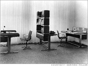
Image 2: From Fortune. In a black-and-white image of a modern office interior, two desks flank a bookshelf-like room divider, creating separate spaces with matching desks and chairs.

NY Times: treadmills in the office. You know how there are tons of coffee table books showing people in their houses, talking about the stuff they use for their daily routines? I would like to see more about office space and how people REALLY use them... specifically how people are working out the problem of sitting still all day. To me treadmills go along with adjustable chairs, ergonomic stools, and the variety of office equipment that is specifically designed so that people with disabilities can work in offices (or at home).
It reminds me of Herman Miller's Action Office, which, when it was developed in the 1960s, brought the possibility of flexibility to office design-- and despite the general disdain for cubicles at least they allow a little more flexibility than the static grid that preceded (which we can remember through the fabulous TV show Mad Men, furnished in vintage Herman Miller.. but I am getting off topic here).
Anyway-- the Times says that "still, to most, work-walking is 'a freaky thing to do,' said Joe Stirt, 60, an anesthesiologist in Charlottesville, Va., who works and blogs in his off hours while walking up to six hours a day in his home office." "Freak" is in the eye of the beholder, of course...

Wall Street Journal via Core77: New Open Solutions High-Tech Usability Lab. This article is a little business jargon-y but it's interesting to note how market research has changed over the years.. going from "what would you buy" to
Usability tests can be conducted on existing products and at key points throughout the creation of a new product including: during and after the design process, after it's been deployed and when it's deployed in a different cultural environment.
Figuring out WHO you design for and all the many people who might not quite fit with your initial assumptions is basically what usability is all about. I wish I could figure out what "high tech" methods they use to figure this out!

Core 77 blogger hipstomp is "missing the tactility" of flip-phones vs. the new movement in many phones toward touchscreens. I totally agree-- hands used to keyboards, not to mention shakier hands or ones that find it hard to hit touch-screens precisely will benefit from the choice of high-performance phones that have buttons on them. The Blackberry Pearl may end up being the choice of many who like the feel of flips and buttons over the slippery smooth iPhone.

disability politics


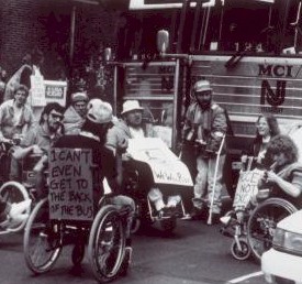
ADAPT public transit protest, Philadelphia, 1989. Image from the National Museum of American History's online Disability Rights Movement exhibition. Description: a black-and-white image of a crowd of people, many in wheelchairs, one at center with two canes, protesting outside a New Jersey Transit bus. In the foreground, we can read the sign on the back of one of the protesters' wheelchairs: "I CAN'T EVEN GET TO THE BACK OF THE BUS."

Memo to Governor Palin from Penny Richards:

Vice-president Cheney, by all accounts, loves his daughter Mary--but it doesn't make the administration in which he serves any friendlier to gay marriage or same-sex parents. And Sarah Palin, by all accounts, loves her little son--but that doesn't mean the administration in which she'd serve would set any priorities for the equality of people with developmental disabilities.

Paul Longmore, "What Kind of Advocacy Do People With Disabilities Really Need?":

In their convention speeches, Palin, John, and even Cindy McCain focused only on children. The media have talked almost exclusively about children too. What so many people seem to forget is that children with disabilities grow up to become adults. Ninety percent of the 54 million Americans with disabilities are adults. Most acquired their disabilities after childhood.

In addition, the media talk has mostly been about “compassion” not about “issues.” There has been little discussion about issues that matter to people with disabilities of all ages, issues such as health insurance, community-based personal assistance services, education, employment, and civil rights.

Finally, ADAPT is in DC right now with tents set up as DUH City (cleverly, HUD spelled backwards) to protest the lack of attention either candidate has paid to the problems of housing and poverty that many people with disabilities experience.


Friday, July 18, 2008

personal histories of design

the design historian in me loooooves this history of chairs that has nothing to do with big names or evolution of styles:


A few quick things I take away:
- chairs are necessarily both visual and haptic things. No matter how high-design, hoity-toity a chair is, we seem almost always to ask under our breath, "is it comfortable?"
- the answer to that question is often as much about personal history as bodily experience
- it's surprising to me that he doesn't include wheelchairs

It got me thinking about personal histories of design.. artworks or writings that highlight how important particular tools are to how we express ourselves and live everyday. Here are some..

A fictional video-story of a fashionable woman and her walker, via Missability

Wheelchair Dancer discusses the importance of complete alignment in her wheelchair, making clear that the chair is not at all marginal to the dance.

Wednesday, July 9, 2008

playgrounds

Image from NY Times: a 5-year-old boy in a baseball cap sits in a wheelchair to the left of the frame. His mother holds his hand as he reaches for a bright green digger at a playground sandbox.


When I was in San Francisco recently, I was amazed at the huge and fun playground in Golden Gate Park-- there were so many different options there that would have been fun for a lot of different sizes/shapes-- in fact I had a hard time restraining myself (and didn't much) from playing on the spinning flower-shaped chairs or climbing the big rope spiderweb myself. I was thinking that the spacious rolling rubberized landscape was uncluttered enough that kids and parents with wheelchairs could get around, and there were options at different levels that would be fun for people with various impairments.

This NY Times article
reports on how hard it is to fund accessible playgrounds, but that a few organizations have pulled it off in the Northeast (this is a regional article). The emphasis is on play spaces that can be used by everyone, and several parents quoted in the article mention the problem of going to playgrounds that are accessible only to some of their kids.
- Boundless Playgrounds has helped CT and NJ communities build playground with things like raised sandboxes so kids in wheelchairs can play and toys like the extended-arm shovel in the image.
- Miracle Fields is an organization that builds accessible baseball fields-- 4 in the NY region and more than 10 planned, says the article.

Wednesday, June 25, 2008

fun little links

- I have always heard good things about the NYU Interactive Technology Program, and this wii-powered large-scale drawing tool for wheelchair users sounds awesome.

Digital Wheel Art from YoungHyun Chung on Vimeo.
via Wheelchair Dancer, who got a little test drive. The video is of a young man in a power wheelchair, moving back and forth controlling brightly colored lines across a digital canvas. At one point he says (subtitled) "I know what I am gonna do."

- I love people who use stuff and redesign that stuff to make it work better.
Vietnamese pedicab driver designs a better pedicab that (via Core77) "resembles a bicycle making love to a wheelchair."

- New design doesn't always fit old infrastructure.
The NY Times hits the hard issues: when ergonomic toothbrushes don't fit in ye olde toothbrush holder.

- Is the iPhone less usable for women because of "the fingernail problem"? (via UnBeige, who seem unnecessarily snarky about it. Only yokels complain about bad design?)


democratic cities

I feel like there has been a lot in the press lately about urban design and the "democratic" city. One of the endless fascinating things about urban life is how it is both public and private, accessible and inaccessible. The city for Baudelaire's flâneur is all about roaming about and being inspired, titillated, and entertained by the people and places of the city. I always felt as a longtime New Yorker that I am never alone as long as I have the city streets. But of course, the city has its flip side-- you can see and be seen, but you can also see where you are not welcome, or be seen in an unpleasant way, stared at out of curiosity, fear, or horror, or shoved out because you don't belong.

- In the Doors of Perception blog, an interview between John Thackera and Sunil Abraham is mainly about eco politics and sustainability in building cities. They emphasize a balance between speed and "slowth" (must be a british thing), not abandoning all goals of modernity and efficiency, but emphasizing local resources and measured mobility alongside speed of information. Their comments on urban planning as a government/commerce project are great:

JT. Show me a city with a “dynamic image” and I will show you an unsustainable city. “Dynamic” usually means high entropy buildings, financial speculation on a massive scale, and a low degree of social participation. From now on, the most interesting cities will be those whose citizens are able to invest their energy and creativity on “re-inhabitation” within the unique ecosystems of their place. This approach will often involve adaptive or more intense uses of existing infrastructure rather than the construction of signature buildings - and sometimes this approach will mean building nothing, nothing at all. To live sustainably we need to place more value on the here and now: a lot of destruction is caused when design is obsessed with the there, and the next - and the “dynamic”.

SA. First, the dynamism of a city can be found in the informal sector which in most developing countries accounts for 70% of employment. It is also where legal, technical and market limits and norms are challenged and redefined as everyday practice. The informal economy also has a much lighter infastructure. [...]

This last comment strikes me as so smart-- all the action is in the "informal sector" where streamlined resource use is not about "efficiency" or government protocol, but about reality. This "informal economy" is also run by personal relationships, not bureaucracy:

[SA continues]: ...non-market micro-economies such as gifting, barter, collectives and commons in developing countries are more effective than classical development interventions in addressing problems of social development. For example, home-based care is cheaper and more effective than hospice-based care for people living with HIV/AIDS. I would like to see more celebration of the informal sector, informal practices and non-market micro-economies.

-
On a way fluffier note, the weird NY Times T Magazine style blog had a post about "off-limits" NY places. It is probably true that being hard to get into increases the "magnetism" of some spaces-- this is the whole model on which social clubs are based, right? I was glad to see a lengthy comment bemoaning the "travesty" of having so many architectural wonders of NY as spaces only for the rich. No mention of wheelchair accessibility (unsurprisingly) but I was thinking about what kind of exclusivity physical inaccessibility makes. When I walk around New York, I am often aware of how style and physical access are twinned, that high-end places often involve some form of physical venture to get into-- made all too clear to me, for example, when I mistakenly took my nonogenarian grandmother to a gorgeous, exquisitely designed vegetarian Korean restaurant where the seating was on the floor with legs shoved into a recessed hole under the table. Is a lack of ramp, or a narrow dark passageway, or the big heavy door at so many galleries and fancy stores, the same kind of message as a bouncer or the ubiquitous "girl with a list" at NY parties (or so I see when I walk by them)? It's a bit different, to be sure. Maybe it's more about asking you to feel unsafe for a second, increasing the "magnetism" via risk and fear? The more I look the more i think that the whole high-end fashion/design world is about this-- making you feel uncomfortable as a gateway. Ugh.

brand new blog manifesto

So, time to write a bit about what this blog is about. This is my Right to Design Manifesto.

I chose this title for my blog that because it makes sense to me to describe the kind of design and design issues I am following. So:

- First, it is kind of a question. Do we have a right to design? That is, do we have a right to designed things that fit us, that work well, and that are comfortable? When is bad design a violation of civil rights or human rights? A sociologist met recently pointed out to me that current disability law is one of the only official avenues of citizen complaint about poor public design. Even twenty years after the ADA, though, these questions are somewhat unresolved in the terminology of “reasonable accommodation.” I think of the “right to design” as a question, a provocative idea that prods us to ask what rights are, and also how design works to provide or block access-- not just to buildings or places, but to experiences that we might define as part of citizenship.

- Second, there is “the right to design” as a verb. Do we have a right to design things, to demand to make our own world different? This part of the argument comes out of years of observing and participating in debates around sustainable, social, and universal design. A lot of designers want to integrate these alternative, progressive ideas into their practice, but they can’t because their clients are not interested, considering these approaches to be unmarketable, or because they don't pass the tests of contemporary aesthetic or intellectual design practice. I, too, have often fallen into the rut of pessimism, thinking when I see a really great prototype or student design project, ‘well, that’s great but it will never get made.”

The way design appears in our current world is as commerce. Design is fashion, is consumption, is the latest desired object. This is indeed one part of design, but it is not the only part. If we see the design world as entirely under the control of profit motives and rapid fashion cycles, we become disheartened, believing that design that responds to broader conceptions of human need and desire is just a "nice idea" that is out of reach on a practical level. One of the best responses I have seen to this feeling of skepticism and disempowerment is from the Social Design Site. In this wonderful 7-minute introduction to their project and to “social design,” this international and interdisciplinary crew assert that “We cannot NOT change the world” – everything we do changes the world. Everything makes the world different, re-designs the world.

I love this part: “We are living in a very complex world, and in everything we do, whether we are aware of it or not, we constantly shape it. We as people are constantly acting in relation to other people, and by doing so, each and every one of us creates the world we live in.” This is a pretty simple observation, yet it reminds me that we so often look at the world as “done,” already made by the people who run governments and own cranes and build bridges, tunnels, roads, buildings, appliances, clothes, and computers. Especially for people with disabilities, the world seems to be made by others, others who likely do not have much imagination about body types, sizes, strengths, and abilities in mind. For me, the “right to design” is about seeing the world as an unfinished design project with still a lot of spaces to slip a hand in and fiddle with the machinery.

Well, that's about as manifesto-y as I can get. I think this blog will vary widely in scope, examining the high-fancy-fluffy design world as well as world news and politics for questions of design and inclusion. I am new to blogging in this formal way-- please comment if you're reading and have questions, critiques, or just want to say hi.

Saturday, June 7, 2008

disability and creativity sites of interest

The Missability Radio Show A WGBR-Boston radio show about disability and creativity. I love the whimsical and crafty aesthetic on this website and need to catch up on some radio shows on it ASAP. So many creative projects worth mentioning after just a few minutes on the site.. a Walking Stick Cosy Competition, an Etsy store, and much more... the use of old-time radio/entertainment aesthetic is apt for radio stuff, of course, but also seems to subvert the freak show history of early 20th century pop culture.
(image from Missability.com is of a handpainted cardboard sculpture of an old-time radio with red stripes atop a table covered with a handmade quilt that reads "Missability")

Also via Missability: Pimp My Guide, 2 videos on YouTube about customizing guide dog harnesses.

Access Hacks. I first saw this link-filled, fact-packed post from Liz Henry's blog somewhere out in cyberspace, and since have followed her links to a bunch of other places, including...

Gearability
, a blog by woman named Marty, who writes about caring for her stepfather as well as having her own health concerns. The blog discusses everything from electronic calendar use in a nursing home to wheelchair cupholders. As an avid reader of sites like Ikea Hacker, I really dig how she seems to see every product, material, gadget out there as fodder for redesign and customization.

On a non-DIY note, fans of Wallace & Gromit must check out these Creature Discomforts PSA spots from British TV.

a world without stairs?

I recently met the pioneering disability historian Paul Longmore at SF State, a true pleasure not only because his work on disability history has been so important to my learning, but because he talked to me for 2 hours about my project, asked all kinds of useful questions, and sent me on my way with a notebook full of notes and thoughts. Anyway, one thing he mentioned as we were talking about design, accessibility, universality, etc, was that the facilities director at SF State is entirely committed to universal design. When they started a renovation project for the library recently, and the architects came in to show their plans, the guy apparently took one look at the entrance they proposed and said (something like), "no, that won't work-- we don't do stairs at SF State."

It got me thinking after the conversation-- is an accessible world a world without stairs? Universal Design promises spaces designed for all, and advises, when possible, to avoid separate entrances and pathways for people using wheelchairs, walkers, etc. So a gently sloped entrance, or maybe an understory at ground level and an elevator, are preferable to a main entrance stair and a side ramp. In practice, the main thing this means is reminding architects to do away with the small, unnecessary sets of stairs that might make an otherwise pretty accessible place or building inaccessible (like 2-3 stairs on a park path or in front of a house or building). But what about as an entire design strategy? A few thoughts...

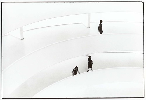
- The first thing that pops into my head is: is the Guggenheim in NY, completed in 1959, accessible? Or-- more precisely-- is its principal design focus, the long spiral ramp around an open atrium, universal?
Guggenheim. New York. c. 1975
Photo by ghougham on flickr.
(Image: a ghostly Guggenheim. Two long ramps sweep across the black-and-white image, with three small figures seen, one on the top ramp and two below.)

John Hockenberry describes the Guggenheim as "the most spectacular (if not the largest) indoor wheelchair ramp in the Western Hemisphere... Frank Lloyd Wright's personal gift to me and my manual titanium-frame wheelchair" (NYT, 1995). Was FLW aware of this angle-- or unconsciously aware, having lived through all of the 20th century, with polio, 2 wars, etc?

- The long descending ramp is a common theme in museum design, for example at the prize-winning Mercedes-Benz Museum in Stuttgart, completed 2001.
by Unstudio, & via Core77 Clogger. Image: architectural rendering of Unstudio's Mercedez-Benz Museum in cross-section, with ramps encircling the building to connect concrete-slab floors.

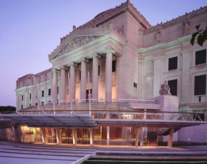
The Brooklyn Museum's renovation a few years ago put a new ground-level entrance hall below the grand temple-like stair of the original Howe and Lescaze building.
Image from Architectural Record
(Image: The Brooklyn Museum, a classical temple-style building complete with Greek pediment and Corinthian columns. Below the column facade is the new entrance, an open glass arcade at ground level.)
Entering gives the feeling of going through a catacombs, with heavy brick arches supporting the building, an apt sensation for the entrance to house of collections. I think the driving principle in the redesign was to make it more accessible in a community sense-- not the mansion on the hill, but a Brooklyn Museum that is open to Brooklyn. There are a lot of nice metaphorical angles to the idea of all of us getting in at the ground level. Shame is that they included a stepped atrium to get down slightly below street level-- the side paths are step-less, but the design misses its chance on the world without stairs.

Thursday, June 5, 2008

odd (and old) links about how designers try to figure out who they are designing for

- Designing for the Senior Surge Wall Street Journal shows designers at GE wearing giant rubber gloves and glasses with scratched lenses to show how they try to understand the needs of an aging population in appliances. The new features they come up with-- a faucet that taps on and off, a double oven that fits into a single-sized space and has easier to open double doors-- are dubbed "aging-friendly" but would clearly benefit anyone (the double oven also seems like an energy saver since it separates a single-meal section from a section "big enough for a 22-lb turkey").
- via treehugger way back in 2006: Eco- and UD House demonstration by Panasonic also had designers using goggles to simulate visual impairment. Design features include unified standards for color and type size to enhance usability, as well as rounded furniture edges, wide threshold-less doorways. Some of the "sophisticated digital devices" also have voice guidance-- something I wish I had to teach me how to dress my second life avatar.
-

hello interweb

I am starting this blog to try to keep track of links, images, thoughts, etc about design, rights, and particularly the intersection between disability issues and design. I am in the early stages of a dissertation on how designers and users tried to improve everyday spaces and objects to make them more functional for a range of physical abilities, both prompted by rights legislation and not, during the second half of the twentieth century (focusing on the decades leading up to the passage of the Americans with Disabilities Act in 1990). That means things like custom cars, lighter and more flexible wheelchairs, and architectural accessibility, as well as "universal" design in buildings and products so that everyone can use them. This project comes out of several years of studying socially- and environmentally-conscious design; ultimately I am interested in how the built world responds to social change (or fails to).

A note about accessibility: when I use images in this blog I will describe them as best I can for text-only readers. I am new to this practice (though with art history training I should be better at it!). Please tell me if you have any problems reading this blog, for this reason or any others. I am new to blogging in general, so I genuinely appreciate constructive criticism of any kind.