It got me thinking after the conversation-- is an accessible world a world without stairs? Universal Design promises spaces designed for all, and advises, when possible, to avoid separate entrances and pathways for people using wheelchairs, walkers, etc. So a gently sloped entrance, or maybe an understory at ground level and an elevator, are preferable to a main entrance stair and a side ramp. In practice, the main thing this means is reminding architects to do away with the small, unnecessary sets of stairs that might make an otherwise pretty accessible place or building inaccessible (like 2-3 stairs on a park path or in front of a house or building). But what about as an entire design strategy? A few thoughts...
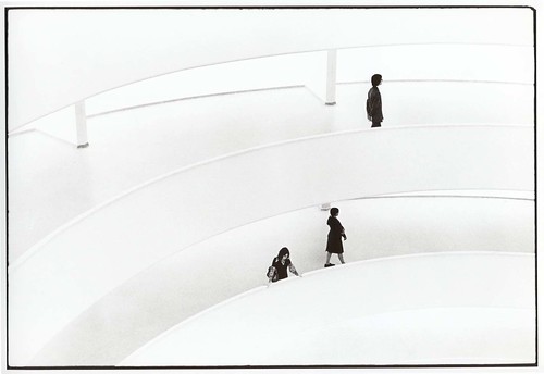
- The first thing that pops into my head is: is the Guggenheim in NY, completed in 1959, accessible? Or-- more precisely-- is its principal design focus, the long spiral ramp around an open atrium, universal?

Photo by ghougham on flickr.
(Image: a ghostly Guggenheim. Two long ramps sweep across the black-and-white image, with three small figures seen, one on the top ramp and two below.)
John Hockenberry describes the Guggenheim as "the most spectacular (if not the largest) indoor wheelchair ramp in the Western Hemisphere... Frank Lloyd Wright's personal gift to me and my manual titanium-frame wheelchair" (NYT, 1995). Was FLW aware of this angle-- or unconsciously aware, having lived through all of the 20th century, with polio, 2 wars, etc?
 by Unstudio, & via Core77 Clogger. Image: architectural rendering of Unstudio's Mercedez-Benz Museum in cross-section, with ramps encircling the building to connect concrete-slab floors.
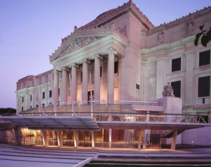
The Brooklyn Museum's renovation a few years ago put a new ground-level entrance hall below the grand temple-like stair of the original Howe and Lescaze building.
 Image from Architectural Record
(Image: The Brooklyn Museum, a classical temple-style building complete with Greek pediment and Corinthian columns. Below the column facade is the new entrance, an open glass arcade at ground level.)
Entering gives the feeling of going through a catacombs, with heavy brick arches supporting the building, an apt sensation for the entrance to house of collections. I think the driving principle in the redesign was to make it more accessible in a community sense-- not the mansion on the hill, but a Brooklyn Museum that is open to Brooklyn. There are a lot of nice metaphorical angles to the idea of all of us getting in at the ground level. Shame is that they included a stepped atrium to get down slightly below street level-- the side paths are step-less, but the design misses its chance on the world without stairs.

Photo by ghougham on flickr.
(Image: a ghostly Guggenheim. Two long ramps sweep across the black-and-white image, with three small figures seen, one on the top ramp and two below.)
John Hockenberry describes the Guggenheim as "the most spectacular (if not the largest) indoor wheelchair ramp in the Western Hemisphere... Frank Lloyd Wright's personal gift to me and my manual titanium-frame wheelchair" (NYT, 1995). Was FLW aware of this angle-- or unconsciously aware, having lived through all of the 20th century, with polio, 2 wars, etc?
- The long descending ramp is a common theme in museum design, for example at the prize-winning Mercedes-Benz Museum in Stuttgart, completed 2001.
 by Unstudio, & via Core77 Clogger. Image: architectural rendering of Unstudio's Mercedez-Benz Museum in cross-section, with ramps encircling the building to connect concrete-slab floors.
The Brooklyn Museum's renovation a few years ago put a new ground-level entrance hall below the grand temple-like stair of the original Howe and Lescaze building.
 Image from Architectural Record
(Image: The Brooklyn Museum, a classical temple-style building complete with Greek pediment and Corinthian columns. Below the column facade is the new entrance, an open glass arcade at ground level.)
Entering gives the feeling of going through a catacombs, with heavy brick arches supporting the building, an apt sensation for the entrance to house of collections. I think the driving principle in the redesign was to make it more accessible in a community sense-- not the mansion on the hill, but a Brooklyn Museum that is open to Brooklyn. There are a lot of nice metaphorical angles to the idea of all of us getting in at the ground level. Shame is that they included a stepped atrium to get down slightly below street level-- the side paths are step-less, but the design misses its chance on the world without stairs.


No comments:
Post a Comment