A blog about universal and accessible design

Showing posts with label universal. Show all posts

Monday, May 9, 2011

Smithsonian Podcast on Universal Design

I'm excited to say that the Smithsonian's Lemelson Center interviewed me recently about my work on universal design. The podcast followed up on a special symposium on "Food for Tomorrow" in which I presented some of my research about how new awareness of the needs of people with disabilities has changed design of kitchens and kitchen tools, including such examples as the Cuisinart food processor and (of course) OXO GoodGrips.

There is a great blog post by National Museum of American History curator Katherine Ott to accompany the podcast. Here is an excerpt explaining the origins of the term "universal design":

Universal design rejects traditional "separate but equal" facilities for people with disabilities. The original principles of universal design grew out of a 1974-77 Department of Education grant to architect Ron Mace that involved extensive product and architectural analysis. That lead to a working group to develop core principles for universally-designed facilities, which would provide for equitable and flexible use; be simple and intuitive; present perceptible and sensory information; tolerate error; entail minimal physical effort; and be of an accessible size and orientation. Mace used a wheelchair as a result of contracting polio when he was a boy. His early engineering and design talent resulted in numerous gadgets and adaptations and eventually a career in dismantling architectural barriers.

Listen to the podcast here. Thanks to the Lemelson Center for interviewing me and asking such great (easy ) questions.

In addition to discussing mass-market products like the Cuisinart and OXO, I also mention how people with disabilities themselves altered kitchens and other parts of their houses to make pre-existing spaces work for them. Here are some images from The Toomey J Gazette, the magazine "by and for respiratory polios" that ran from 1958-1969 (and then became the Rehabilitation Gazette). The images show (1) a kitchen sink with the cabinet below cut out to make space for a wheelchair, and a decorative curtain added to maintain a tidy look; and (2) a variety of storage approaches for pots and pans and pantry items, such as lazy susans, pegboards, and wall-mounted racks - all of which were common sights in 1950s/60s households, but here were selected for their particular advantages to people with disabilities. Images are from "Homemaking," The Toomey J Gazette, 1968.


Monday, January 31, 2011

Worlds with and without stairs II


Above is a video that has been circulating in my facebook feed and various blogs, showing an experiment to see if altering the experience of walking up stairs would change people's likelihood of taking the stairs rather than the escalator. It's pretty cute and simple, and it's nice to see people having a fun time in the mundane setting of a subway station. This is not a strictly "accessible" form of design, though it does play off of choice between ways of moving through a place, which does have to do with physical access. And it makes me wonder - how much do designers think about stairs? Are they inviting, discouraging, or just plain functional? In a world when we often have the choice of elevator, escalator, stairs or ramps, could designers make these experiences more distinct?


When I first started this blog, I posted about the idea of a "world without stairs" - wondering whether an accessible world could actually mean the disappearance of such a standard architectural feature as the stairs.

I've learned a few things since then... one is, of course, that stairs are just one kind of physical barrier, for one kind of access issue. In fact, many people with disabilities prefer stairs to ramps - for example, if they use a prosthetic leg or a cane, that straight platform can be easier to use. The first ever Architectural Standard in the U.S. included not only measurements for ramps, but design guidelines for stair heights and angles that would not interfere with those who needed to drag their feet up the front of stairs:


(image: figure showing unacceptable and acceptable stair designs, from the 1961 American National Standards Institute's Specifications for Making Buildings and Facilities Accessible to, and Usable by, the Physically Handicapped, which became the guidelines for state and federal accessibility laws in the 1960s and 70s).

In my earlier post on stairs, I noted some architectural examples (such as the Guggenheim) that used alternatives to stepped surfaces as a design feature. These were not spaces explicitly designed for wheelchair use (in fact some of them might belong in the Facebook "Wheelchair Ramps and Access from Hell" photo collection), but might suggest ways of making access an explicit part of design, rather than an afterthought.

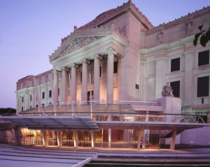
I was also thinking about ways that stairs themselves can be accessible or inaccessible. For those who walk up and down stairs, they can have a pronounced effect on how we experience a place. Think of the difference between ascending a grand staircase, feeling that you are rising up to an important and elegant place - perhaps like the Metropolitan Opera's lush red stairways - and scrambling up the narrow spiral stairs of a cathedral bell tower or a lighthouse.

In some cases architects consciously use stairways to dramatize walking through the space - in other cases, I wonder what thought went into a stair design.


At the Frank Furness-designed Philadelphia Academy of Fine Arts, the central stair to the galleries has no handrail. The effect is subtle, but nonetheless jarring - your hand might reach out for something to hold, but instead you feel a bit out of sorts, pitched downward with no assurance. In the context of this historic building, we get a sense of a different time and a different set of expectations about bodily composure walking down the stairs. (Image shows a woman from the back, descending a set of stone stairs without a handrail in sight). In 2011, the museum has been designed to provide an alternate route to the stairs, but in its original design, Furness certainly made a distinct statement for those coming and going into this temple for art.

On a recent trip I discovered another set of museum steps that literally stopped me in my tracks. The newish Center for Contemporary Art in Cincinnati is the only American building by Zaha Hadid, the Pritzker Prize-winning architect best known for prototype or drawn work, so I was excited to visit while I was in town for a wedding. The sleek lines and geometry of the museum building are appealing, but the stairs immediately stood out to me - and not in a particularly good way. Criss-crossing the void in the main entry lobby, these stairs have a much shorter rise, and longer step, than we expect in standard staircases. They are so awkward to walk up that I almost wondered if this was an installation of the museum collection itself. As a long-ish strider I was constantly tripping up these stairs, and almost fell on the way up. I asked the guards if they had gotten used to them over time, and they chuckled, no, and confirmed that I was far from the only visitor to ask about the stair heights.

It's interesting to me to wonder how Hadid came to these stairs. Did she deliberately design something that would halt your walk, maybe prepare you to pay attention as you see the artworks? Is this an explicit message that we should not relax too much or feel too comfortable in a museum? Or are the stairs, like many functional elements of contemporary architecture, just the product of some low-level drafts-person who designs based on general instructions of the architect? In any case, I wondered if Hadid had ever walked up these stairs. They are certainly dramatic, but the ultimate result for me was to feel frustrated and a bit indignant - how dare this architect tell me how to walk! And of course, I thought of how these steps would feel for someone with a physical impairment - for whom that break in routine might be more than an annoyance.

Leaving the CCA, I decided to take the elevator down. In a world with stairs, we might choose to avoid them too.

Tuesday, February 9, 2010


Dwell presents | The Bathroom Reinvented: Universal Design in Public Bathrooms | Part 1 | by Gary Nadeau from gary nadeau on Vimeo.


Nice video clip of Gary Nadeau (of Dwell magazine) visiting public bathrooms with Dan Formosa and Richard Whitehall of Smart Design (designers of, among other things, OXO Good Grips). They are a great odd couple on Universal Design.. Formosa gives the technical definition - its roots in barrier-free legislation - while Whitehall gives the larger meaning/context: Universal Design suggests the possibility of attending to human needs, including emotional, political, social.

Also maybe the best looking collection of people ever collected to expound on the experience of going to the bathroom.

Thursday, November 12, 2009

two new architecture projects

very different ones...

- The Interlock House was a recent entry in the Solar Decathlon in DC (via Urbantrekker). Designed by a team from Iowa State, the house "is designed specifically to appeal to seniors and meets all regulations for accessibility under the 1990 Americans with Disabilities Act. The house is also designed to "interlock" into existing communities instead of taking over undeveloped land—a much more sustainable approach to building." (nice way of putting the joint goals of universal design and sustainability)


Image: Computer drawing of the Interlock House, a modern, rectangular house with an angled roof covered in solar panels and surrounded by a yard and blooming garden. A wide, flat deck that wraps around the corner. In the mock-up, an older couple go about their daily tasks: she is arriving with a bag in hand, he is raking leaves.

- Temporary solar-powered wheelchair lifts are to be installed at the Duke of York steps in London for the Festival of Architecture next year (via bd). Cool solution for the age-old historic buildings accessibility problem, and fitting modern look for the festival. Reminds me of my old post on a world without stairs.
Image: Computer drawing of the three-tiered Duke of York steps, with the mock-ups of three glass towers installed on the landings to house wheelchair lifts.


Wednesday, December 10, 2008

Arrogance will getcha


Image: Fiskars Rotary Cutter and Softtouch Scissors, designed by a team led by Jim Boda and Doug Birkholz, now of Inspire Design (image via Inspire).

I just had a nice chat with Jim Boda, who was head of R&D at Fiskars' US division in the early 90s when they developed Softtouch Scissors. Originally called the "Golden Series," the scissors were developed with the goal of making cutting easier for older users and people with manual disabilities. A spring in the scissors helps them open automatically, saving the effort and eventual discomfort of opening after each cut, while the innovative offset handles and straight bottom edge let you rest them on the table during use. Focus group feedback indicated that they would be useful and appealing to a broad range of users, and the new name reflected this comfort and ease. I see these every time I go to the fabric shop, as all the fabric measure/cutters use them.

Jim commented that, when it comes to designing tools/products, "one of the things that you really want to do is separate yourself—a lot of things can be intuitive, but in watching other people use products I find they really use them differently. We could design intuitively, based on own experiences, but when we get it wrong it's usually because of arrogance. Especially when it comes to the human body... we are all made up of different parts and use them in different ways." Thanks, Jim. He also mentioned that the US division was the first to really bring product innovation to the company-- with total market dominance in Finland, the home company didn't really understand the need-- and that US R&D helped the Finnish and British divisions set up their own design/R&D teams in the 90s. Interesting trans-Atlantic business story.

Sunday, November 2, 2008

accessible and Universal


Image: A small crowd, including one person in a wheelchair, wait for a light on a Berkeley curb (with curb cut-- a relative rarity for the time), ca. 1977.

I feel like half of my posts refer to Wheelchair Dancer, but that won't stop me from making more..

In her thoughts on Universal Design here, she raises some interesting distinctions between functionality in design and what she calls "potential" -- the difference, as I read it, between designing for specific disabilities and designing for the body in a broader, maybe more imaginative sense.

In a lot of my writing I use the term "accessible" design separately from "Universal"-- Universal refers, I think, to a specific aspiration in design to try to include the broadest spectrum of users, and is rooted in a historical moment when the design world became aware of Disability Rights. Accessible is a kind of bare-minimum, as in "usable" (functional, in WD's discussion) by people with particular impairments. ADA compliance is accessible design; Universal Design goes beyond (and can even violate) codes and regulations.

She also quotes from a UC Berkeley course description for a studio on "Body-Conscious Design" in which students learn "to evaluate and design environments from the point of view of how they interact with the human body." The specific terms "disability," "accessibility" and "universal" appear nowhere, but clearly this course and its approach come out of the last 30+ years of experimentation in the design world around issues of access and usability; it also recalls Berkeley's legacy as a city and university on the forefront of Disability politics (see above). The language in the description points, I think, to the particular way that design can fulfill a certain dream (or even cliche) of Disability Rights-- that people should be seen in terms of their abilities, not disabilities. I don't want to recall the hackneyed language of "handicapable!"-- but, from the design perspective, functionality really is about ability: what is required of the body to open doors, read signs, operate machines/tools -- and, further, to feel comfortable, supported, welcome?

Another aspect here is what design can't do. In the worlds of sustainable/environmental design, some people have started to propose flexibility as a principle-- that things, forms, systems need to be able to change to accommodate new problems and new learning. Out of necessity, regulations like the ADA require specific benchmarks (this height/grade ramp, this width doorway, this sonic/tactile alert system)-- but they have to be seen as a first step only. To really respond to users, a designed system/space/object should allow the user to respond to it, to change it or rearrange it. I'm keeping my eye out for examples of this approach.. and will report if I find them.

Sunday, October 26, 2008

Universal Voting Booth

From Norway (and via Core77):
Image via Kadabra: mock-up of a voting room with open booths to the left of the frame. The voters in the room are shown as white figures outlined in black: some are in the booths, some line up to deposit their orange ballots into boxes. The figures include women and men, a person with crutches, and a person whose wheelchair peeks out from under one of the booths.

Winners of a recent Norwegian State Design Competition called "Democracy by Design," KADABRA have designed a voting system that can be easily installed in the typical public places that are used for voting. The open booth, low console, and graphic images are the result of a process in which the designers interviewed what they call "elite" users-- I'm thinking that this translates to those with specific needs-- including people with visual, cognitive, and mobility concerns, as well as election volunteers and janitors. The result, they write, is "solutions that are for everyone’s best."

Related:
-Core77 1 Hour Design Competition: Voting Booth due Oct 30
-Marcia Lausen, Design for Democracy: Ballot and Election Design
-primer on disabilities and accessible voting from the Center for an Accessible Society.

electronics of the future-- more touchy-feely?


I have posted a few times about how electronics can be hard to use-- touch screens, tiny numbers, etc. This is probably the #1 thing people mention when I talk to them about what products/spaces are inaccessible by design.

Image from C-Scout: hands demonstrating the smooth white Samsung Touch Sight Camera, which embosses images in Braille as well as providing a few seconds of sound to accompany each picture.

Here are some lovely prototypes for electronic gadgets designed for blind people and people w/ low vision. The article mentions a watch, a camera, a debit-card reader/PIN interface, and a Braille reader/writer that all integrate new digital approaches to tactile display. The article also mentions how these applications could improve usability for all, as is the mantra of Universal Design:
"Of course, many of these technologies can provide benefits to sighted people. For example, a tactile surface could be applied to a bedside clock, enabling one half of a couple to find out what time it is without disturbing the other."

Wednesday, July 9, 2008

playgrounds

Image from NY Times: a 5-year-old boy in a baseball cap sits in a wheelchair to the left of the frame. His mother holds his hand as he reaches for a bright green digger at a playground sandbox.


When I was in San Francisco recently, I was amazed at the huge and fun playground in Golden Gate Park-- there were so many different options there that would have been fun for a lot of different sizes/shapes-- in fact I had a hard time restraining myself (and didn't much) from playing on the spinning flower-shaped chairs or climbing the big rope spiderweb myself. I was thinking that the spacious rolling rubberized landscape was uncluttered enough that kids and parents with wheelchairs could get around, and there were options at different levels that would be fun for people with various impairments.

This NY Times article
reports on how hard it is to fund accessible playgrounds, but that a few organizations have pulled it off in the Northeast (this is a regional article). The emphasis is on play spaces that can be used by everyone, and several parents quoted in the article mention the problem of going to playgrounds that are accessible only to some of their kids.
- Boundless Playgrounds has helped CT and NJ communities build playground with things like raised sandboxes so kids in wheelchairs can play and toys like the extended-arm shovel in the image.
- Miracle Fields is an organization that builds accessible baseball fields-- 4 in the NY region and more than 10 planned, says the article.

Saturday, June 7, 2008

a world without stairs?

I recently met the pioneering disability historian Paul Longmore at SF State, a true pleasure not only because his work on disability history has been so important to my learning, but because he talked to me for 2 hours about my project, asked all kinds of useful questions, and sent me on my way with a notebook full of notes and thoughts. Anyway, one thing he mentioned as we were talking about design, accessibility, universality, etc, was that the facilities director at SF State is entirely committed to universal design. When they started a renovation project for the library recently, and the architects came in to show their plans, the guy apparently took one look at the entrance they proposed and said (something like), "no, that won't work-- we don't do stairs at SF State."

It got me thinking after the conversation-- is an accessible world a world without stairs? Universal Design promises spaces designed for all, and advises, when possible, to avoid separate entrances and pathways for people using wheelchairs, walkers, etc. So a gently sloped entrance, or maybe an understory at ground level and an elevator, are preferable to a main entrance stair and a side ramp. In practice, the main thing this means is reminding architects to do away with the small, unnecessary sets of stairs that might make an otherwise pretty accessible place or building inaccessible (like 2-3 stairs on a park path or in front of a house or building). But what about as an entire design strategy? A few thoughts...

- The first thing that pops into my head is: is the Guggenheim in NY, completed in 1959, accessible? Or-- more precisely-- is its principal design focus, the long spiral ramp around an open atrium, universal?
Guggenheim. New York. c. 1975
Photo by ghougham on flickr.
(Image: a ghostly Guggenheim. Two long ramps sweep across the black-and-white image, with three small figures seen, one on the top ramp and two below.)

John Hockenberry describes the Guggenheim as "the most spectacular (if not the largest) indoor wheelchair ramp in the Western Hemisphere... Frank Lloyd Wright's personal gift to me and my manual titanium-frame wheelchair" (NYT, 1995). Was FLW aware of this angle-- or unconsciously aware, having lived through all of the 20th century, with polio, 2 wars, etc?

- The long descending ramp is a common theme in museum design, for example at the prize-winning Mercedes-Benz Museum in Stuttgart, completed 2001.
by Unstudio, & via Core77 Clogger. Image: architectural rendering of Unstudio's Mercedez-Benz Museum in cross-section, with ramps encircling the building to connect concrete-slab floors.

The Brooklyn Museum's renovation a few years ago put a new ground-level entrance hall below the grand temple-like stair of the original Howe and Lescaze building.
Image from Architectural Record
(Image: The Brooklyn Museum, a classical temple-style building complete with Greek pediment and Corinthian columns. Below the column facade is the new entrance, an open glass arcade at ground level.)
Entering gives the feeling of going through a catacombs, with heavy brick arches supporting the building, an apt sensation for the entrance to house of collections. I think the driving principle in the redesign was to make it more accessible in a community sense-- not the mansion on the hill, but a Brooklyn Museum that is open to Brooklyn. There are a lot of nice metaphorical angles to the idea of all of us getting in at the ground level. Shame is that they included a stepped atrium to get down slightly below street level-- the side paths are step-less, but the design misses its chance on the world without stairs.

Thursday, June 5, 2008

odd (and old) links about how designers try to figure out who they are designing for

- Designing for the Senior Surge Wall Street Journal shows designers at GE wearing giant rubber gloves and glasses with scratched lenses to show how they try to understand the needs of an aging population in appliances. The new features they come up with-- a faucet that taps on and off, a double oven that fits into a single-sized space and has easier to open double doors-- are dubbed "aging-friendly" but would clearly benefit anyone (the double oven also seems like an energy saver since it separates a single-meal section from a section "big enough for a 22-lb turkey").
- via treehugger way back in 2006: Eco- and UD House demonstration by Panasonic also had designers using goggles to simulate visual impairment. Design features include unified standards for color and type size to enhance usability, as well as rounded furniture edges, wide threshold-less doorways. Some of the "sophisticated digital devices" also have voice guidance-- something I wish I had to teach me how to dress my second life avatar.
-